Two Gaussian curve alignment
This notebook showcases how msalign performs when dealing with multiple curves in the signal.
The algorithm performs pretty well when aliging clean and noisy data, especially when the
ratio of the two curves is the same (or very similar)
The algoritm is a little less capable when dealing with two curves and the alignment is performed towards the smaller curve.
import numpy as np
from scipy import signal
from scipy.ndimage import shift
import matplotlib.pyplot as plt
from msalign import Aligner
from msalign.utilities import find_nearest_index

plt.style.use('ggplot')
Utility functions
First, let's make a couple of functions that will generate data for us, as well as, show the results
def overlay_plot(ax, x, array, peak):
    """Generate overlay plot, showing each signal and the alignment peak(s)"""
    for i, y in enumerate(array):
        y = (y / y.max()) + (i * 0.2)
        ax.plot(x, y, lw=3)
    ax.axes.get_yaxis().set_visible(False)
    ax.set_xlabel("Index", fontsize=18)
    ax.set_xlim((x[0], x[-1]))
    ax.vlines(peak, *ax.get_ylim())

def plot_peak(ax, x, y, peak, window=100):
    peak_idx = find_nearest_index(x, peak)
    _x = x[peak_idx-window:peak_idx+window]
    _y = y[peak_idx-window:peak_idx+window]
    ax.plot(_x, _y)

    ax.axes.get_yaxis().set_visible(False)
    ax.set_xlim((_x[0], _x[-1]))
    ax.vlines(peak, *ax.get_ylim())

def zoom_plot(axs, x, array, aligned_array, peaks):
    for i, y in enumerate(array):
        for j, peak in enumerate(peaks):
            plot_peak(axs[0, j], x, y, peak)

    for i, y in enumerate(aligned_array):
        for j, peak in enumerate(peaks):
            plot_peak(axs[1, j], x, y, peak)
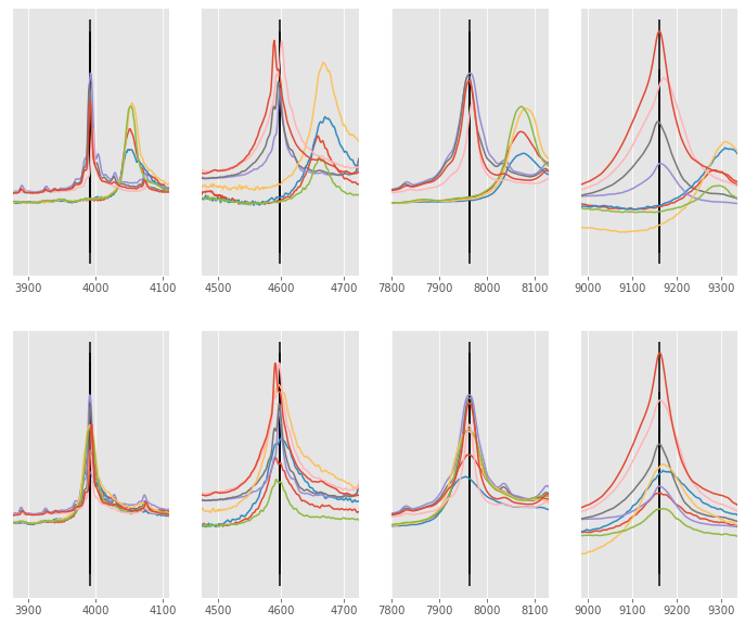
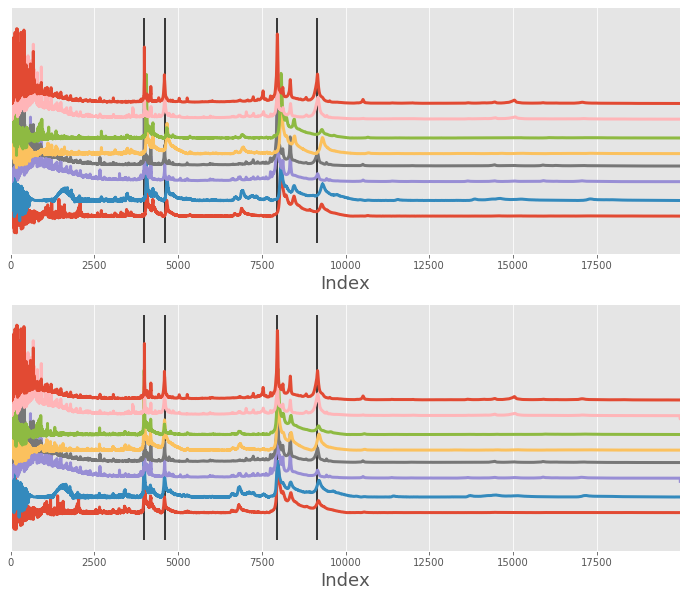
Alignment of the mass spectrometry example
Here is the example used in the MATLAB documentation. Here, the dataset contains 8 signals that differ from each other a little. The alignment is performed by using 4 individual peaks that are common (or mostly common) between the signals
In first instance, we simply align the signals (without rescaling only_shift=True). As you can see, the alignment did relatively good job of shifting each signal near its correct position, but 2/3 of the signals could be slightly improved.
# load data
filename = r"D:\GitHub\msalign\example_data\msalign_test_data.csv"

data = np.genfromtxt(filename, delimiter=",")
x = data[1:, 0]
array = data[1:, 1:].T
peaks = [3991.4, 4598, 7964, 9160]
weights = [60, 100, 60, 100]

# instantiate aligner object
aligner = Aligner(
    x,
    array,
    peaks,
    weights=weights,
    return_shifts=True,
    align_by_index=True,
    only_shift=True,
    method="pchip",
)
aligner.run()
aligned_array, shifts_out = aligner.apply()

# display before and after shifting
fig, ax = plt.subplots(nrows=2, ncols=1, figsize=(12, 10))
overlay_plot(ax[0], x, array, peaks)
overlay_plot(ax[1], x, aligned_array, peaks)

# zoom-in on each peak
fig, ax = plt.subplots(nrows=2, ncols=4, figsize=(12, 10))
zoom_plot(ax, x, array, aligned_array, peaks)
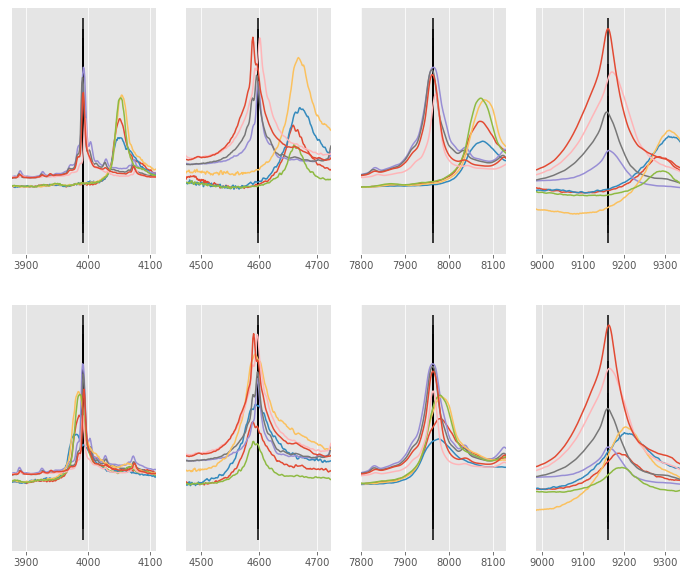
Alignment improvement
We can improve the alignment performance by switching the only_shift keyword parameter to True. This will
ensure that each signal is shifted and rescaled which in practice means the x array is slightly altered on each iteration.
# instantiate aligner object
aligner = Aligner(
    x,
    array,
    peaks,
    weights=weights,
    return_shifts=True,
    align_by_index=True,
    only_shift=False,
    method="pchip",
)
aligner.run()
aligned_array, shifts_out = aligner.apply()

# display before and after shifting
fig, ax = plt.subplots(nrows=2, ncols=1, figsize=(12, 10))
overlay_plot(ax[0], x, array, peaks)
overlay_plot(ax[1], x, aligned_array, peaks)

# zoom-in on each peak
fig, ax = plt.subplots(nrows=2, ncols=4, figsize=(12, 10))
zoom_plot(ax, x, array, aligned_array, peaks)